How to make a histogram in python and r
In this recipe, we will learn what are histograms and where to use them. We will next learn how to plot a histogram using different libraries in python and R.
How to make a histogram?
In this tutorial, we will learn-
• What is a histogram?
• How to make a histogram in python?
Histogram using pandas
Histogram using seaborn
Histogram using matplotlib
Histogram using plotly
• How to make a histogram in R?
Table of Contents
What is a histogram?
A histogram is a tool for visualizing data. It is a graphical representation of the frequency distribution of discrete and continuous data. It is used to visualize vital features of the distribution of the data in an easy-to-understand format. Consider a series of data – (11,12,15,12,12,10,10,13,14,13,14,14,14). The histogram for this data will look like this –
Unlike a bar graph, where the bars indicate categories that do not have a specific order and are separated, the bars in a histogram are connected. The histogram helps in determining the distribution of the data.
Master the Art of Data Cleaning in Machine Learning
How to make a histogram in python?
Python offers many libraries for visualizing data. Some of them include pandas, matplotlib, seaborn and plotly. We will see how to plot a histplot using each of these libraries.
Let us create a data frame to plot.
Code:
#importing pandas library
import pandas as pd
#creating a Data frame
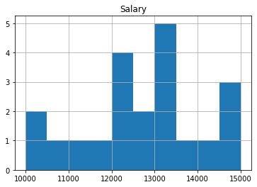
df = pd.DataFrame({
'Salary': [10000,10500,11000,10000,11500,12000,12800,12700,12050,12300,14000,15000,14500,14800,13000,13010,13450,12250,13450,13250,13800]})

Histogram using pandas
We have created a pandas data frame, so we can create a histogram using the pandas library directly. We will make use of the following function-
Pandas.DataFrame.hist()
When we use the function Pandas.DataFrame.hist(), matplotlib.pyplot.hist() is automatically called on each series in the DataFrame.
Syntax: DataFrame.hist(data, column=None, by=None, grid=True, xlabelsize=None, xrot=None, ylabelsize=None, yrot=None, ax=None, sharex=False, sharey=False, figsize=None, layout=None, bins=10, backend=None, legend=False, **kwargs)
Parameters:
Data -> dataframe
Column -> used to plot specific columns in the data frame
binsint -> it’s default value is 10. It represents the number of histogram bins.
Code:

df.hist()

Output:
![]()
Histogram using seaborn
Seaborn is yet another python library used for statistically visualizing the data. The syntax to plot a histogram using seaborn is as follows-
seaborn.histplot(data=None, *, x=None, y=None, hue=None, weights=None, stat='count', bins='auto', binwidth=None, binrange=None, discrete=None, cumulative=False, common_bins=True, common_norm=True, multiple='layer', element='bars', fill=True, shrink=1, kde=False, kde_kws=None, line_kws=None, thresh=0, pthresh=None, pmax=None, cbar=False, cbar_ax=None, cbar_kws=None, palette=None, hue_order=None, hue_norm=None, color=None, log_scale=None, legend=True, ax=None, **kwargs)
Parameters:
data - Input data structure
x, y – parameters specifying positions on the x and y axes
weights - used to weight the contribution of the related data points to the count in each bin
bins – the number of bins
Let's start by loading a dataset. The Titanic dataset, which is available in the seaborn library, will be used.
Code:

#importing required library

import seaborn as sns


#loading the dataset

df=sns.load_dataset("titanic")

Plotting a histogram of the age column.
Code:

#plotting histogram for age variable

sns.histplot(x='age',data=df)
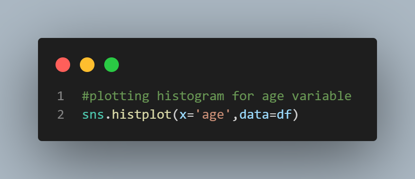
Output:
![]()

Histogram using matplotlib
matplotlib is a python library that is used for data visualization extensively. To plot a histogram using matplotlib, the syntax is as simple as-
matplotlib.pyplot.hist()
Let us plot our data. We will make use of the same titanic dataset imported before.
Code:

#importing matplotlib library

import matplotlib.pyplot as plt


#plotting a histogram

plt.hist(x="age",data=df)

Output:

Histogram using plotly
Plotly is a python library that offers visually appealing graphs and plots to the users. Let us plot a histogram for the age column of the titanic dataset using plotly.
Code:

#importing plotly library

import plotly.express as px


#plotting histogram

fig = px.histogram(df, x="age")

fig.show()

Output:

We can even specify the number of bins
Code:

fig = px.histogram(df, x="age",nbins=20)

fig.show()
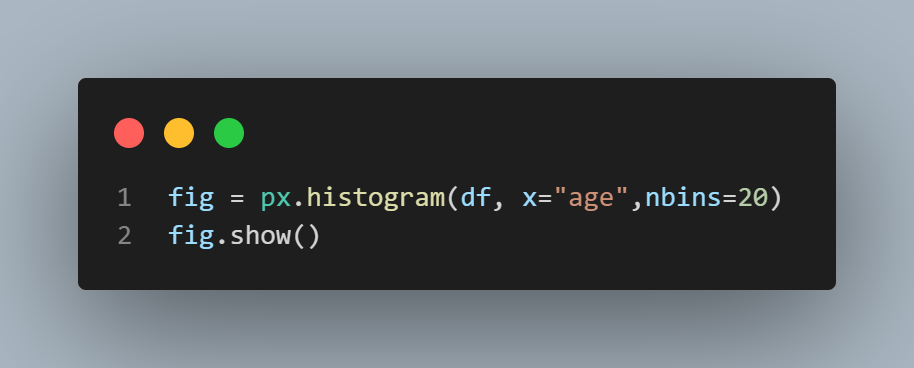
Output:

How to make a histogram in R?
Creating histograms in R is a cakewalk. You can create a histogram simply by using the hist() function. We will make use of the mtcars dataset that is available by default in R. Let us plot a histogram to see for miles per gallon(mpg) column.
Syntax - hist(v,main,xlab,xlim,ylim,breaks,col,border)
Parameters:
v -> numeric values to be used in histogram.
main -> title of the plot
col -> sets color of the bars.
border -> sets border color of each bar.
xlab -> gives description of x-axis.
xlim -> specifies the range of values on the x-axis.
ylim -> specifies the range of values on the y-axis.
breaks -> specifies the width of each bar.
Code:
#loading the dataset

df <- (mtcars)


#plotting a histogram

hist(df$mpg)

Output:


What Users are saying..

Anand Kumpatla
ProjectPro is a unique platform and helps many people in the industry to solve real-life problems with a step-by-step walkthrough of projects. A platform with some fantastic resources to gain... Read More