Tableau Treemap - A Practical Guide to Analyze Data
This short tutorial will help you understand how to create a Treemap in Tableau with step-by-step instructions and real-world examples.
Have you ever wondered how to visualize hierarchical data and gain valuable insights from it effectively? Treemaps in Tableau serve this purpose! Tableau Treemaps offer a dynamic and intuitive way to explore hierarchical structures that help you uncover patterns, trends, and outliers with ease. This tutorial will help you understand the process of creating a Treemap in Tableau - uncovering all the necessary customization options to analyze these powerful visualizations. So, let’s get started!
Table of Contents
- What is Treemap in Tableau?
- How to Create a Treemap in Tableau?
- How to Make a Treemap with More Than Two Variables in Tableau?
- How to Build a Treemap in Tableau with Filters?
- Treemap Drill Down - Creating Treemap inside Treemap in Tableau
- What is the Difference Between Heatmap and Treemap in Tableau?
- Take your Data Visualization Skills to the Next Level with ProjectPro!
What is Treemap in Tableau?
A treemap is a type of chart that displays nested rectangular boxes. The mark type of treemap can be Automatic or Square. In a Treemap, the size and color of rectangular boxes are determined by measure. The Detail or Label on rectangular boxes is determined by dimension.
How to Create a Treemap in Tableau?
The process of making a treemap in Tableau is simple. It starts with connecting Tableau to your data source and dragging the dimensions and measurements you want to visualize onto the Rows and Columns shelves. Then, select the Treemap chart type from the ‘Show Me’ panel to generate the basic Treemap visualization. Further, you need to customize the appearance of the treemap by adjusting colors, borders, labels, and tooltips to enhance clarity and aesthetics. You can also incorporate interactivity by adding filters, parameters, and actions to allow users to explore the data from different perspectives.
Let’s understand with an excellent example - Consider we want to visualize the performance of NFL offensive players across different states and years using a treemap in Tableau. Check out the video to understand how! Also, take a look at the step-by-step instructions below -
Step 1 > Connect the "NFL Offensive Player stats, 1999-2013.xlsx" data set.
Step 2 > Drag the "Home State" dimension and drop it onto the column shelf.
Step 3 > Drag the "College Losses" measure and drop it onto the row shelf.
Step 4 > Under the Show Me option, select Treemap.
Step 5 > Drag the "Year" measure and drop it onto the color under the marks card. This adds a color dimension to the treemap, providing additional insights into the data.
Step 6 > Drag the "Home State" dimension and drop it onto the label or detail under the marks card. This labels each rectangle in the treemap with the corresponding home state, making it easier to interpret the visualization.
How to Make a Treemap with More Than Two Variables in Tableau?
Regarding visualizing complex datasets with multiple variables, Tableau offers robust capabilities to create treemaps that convey rich insights. Let's illustrate the process of creating a treemap with more than two variables using a hypothetical example of retail sales analysis. Imagine you're tasked with analyzing sales performance across different product categories and regions for a chain of retail stores.
For this scenario, the variables we want to visualize include product categories, regions, sales revenue, and profit. Product categories and regions will form the hierarchical structure of the treemap, while sales revenue and profit will be encoded using color and size.
Drag the product categories dimension onto the Rows shelf and the dimension of the region onto the Columns shelf. Next, add the sales revenue measure to the Color encoding shelf to represent revenue using different colors. Then, add the profit margin measure to the Size encoding shelf to adjust the size of the rectangles based on profit margin. Click the ‘Show Me’ label to choose the treemap chart visualization. This is how the visualization will look like -

How to Build a Treemap in Tableau with Filters?
Now, let’s say you want to select a few specific regions to view sales performance and analyze profitability within a particular segment. So, how would you do that?
To apply filters, you can use the Region dimension. Drag the "Region" dimension to the Filters shelf. In the filter dialog box that appears, deselect the regions you don't want to include (in this case, Central and East). Then, click OK to apply the filter.
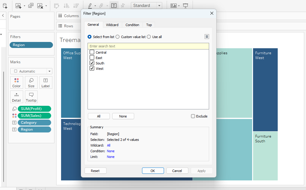
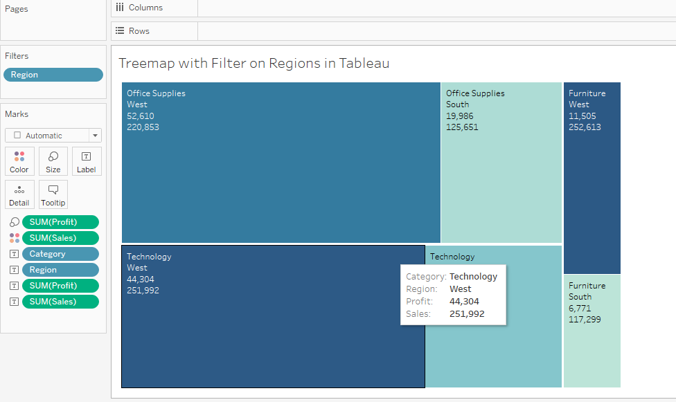
The Treemap will display sales performance and profitability within the selected regions only (excluding Central and East, as per your example).
Treemap Drill Down - Creating Treemap inside Treemap in Tableau
If you want to create a nested treemap in Tableau, you can achieve it through a "drill-down" technique. Users can employ the treemap drill-down to explore hierarchical data structures effortlessly. Creating treemaps within treemaps helps analysts navigate multiple levels of data hierarchy seamlessly. This functionality helps comprehensively visualize nested data, offering insights at various granularities. Users can zoom in to explore specific categories or segments within broader classifications with each click, facilitating a more nuanced understanding of the dataset.
Check out this video on - How to Create a Drill Down Treemap in Tableau? to practically understand the complete process of creating a treemap inside a treemap in Tableau.
To conclude, treemaps serve as effective visualization tools for hierarchical data representation. Yet, confusion often arises between treemaps and heatmaps, particularly within Tableau. The following section will help you understand the clear distinctions between these two chart types to understand their unique functionalities and applications.
What is the Difference Between Heatmap and Treemap in Tableau?
A heatmap represents data values in a matrix format, with individual values represented as colors. It is helpful for identifying patterns and variations across two dimensions. In Tableau, you typically use a heatmap when you have two continuous variables and want to visualize their relationship. For example, you might use a heatmap to show sales performance across different regions over time.
A treemap, on the other hand, displays hierarchical data using nested rectangles. The size and color of each rectangle represent different measures within the data. It's beneficial for visualizing hierarchical structures and comparing proportions within those structures. For instance, you might use a treemap to represent the total sales of different product categories and their sub-categories.

Take your Data Visualization Skills to the Next Level with ProjectPro!
ProjectPro is your one-stop solution to hands-on learning through real-world projects. While this tutorial has provided you with a solid foundation in building and analyzing data using Tableau Treemap, mastering data visualization requires practical experience. With over 250+ solved projects in Data Science, Big Data, and Artificial Intelligence, you can gain the expertise needed to excel in analytical roles and make impactful data-driven decisions. Each project has downloadable source code, hands-on lab features, and step-by-step video explanations. This comprehensive approach ensures you grasp the concepts and develop practical skills immediately applicable to your projects. Whether you prefer to learn by doing, watching, or both, ProjectPro provides the resources to master data visualization and beyond.
Download Materials

What Users are saying..

Abhinav Agarwal
I come from Northwestern University, which is ranked 9th in the US. Although the high-quality academics at school taught me all the basics I needed, obtaining practical experience was a challenge.... Read More