A Practical Guide to Make a Heatmap in Tableau
This tutorial will help you with the process of making a Tableau heatmap and derive meaningful insights from large datasets. | ProjectPro
Heatmaps are powerful visualizations in Tableau that allow users to analyze and understand patterns within large datasets quickly. This tutorial will help you explore what heatmaps are and how to create them in Tableau using examples.
Table of Contents
What is a Heatmap in Tableau?
A heatmap in Tableau is a graphical representation of data where the individual values in a matrix are represented as colors. It's an effective way to visualize data patterns and relationships, especially in large datasets with multiple dimensions. It can be created using one or more measures or dimensions. The mark type of heat map is Density, with at least one continuous measure in the marks card. Heat Maps help locate excess or fewer data points in the visualization, thus finding their usage in various scientific experiments.
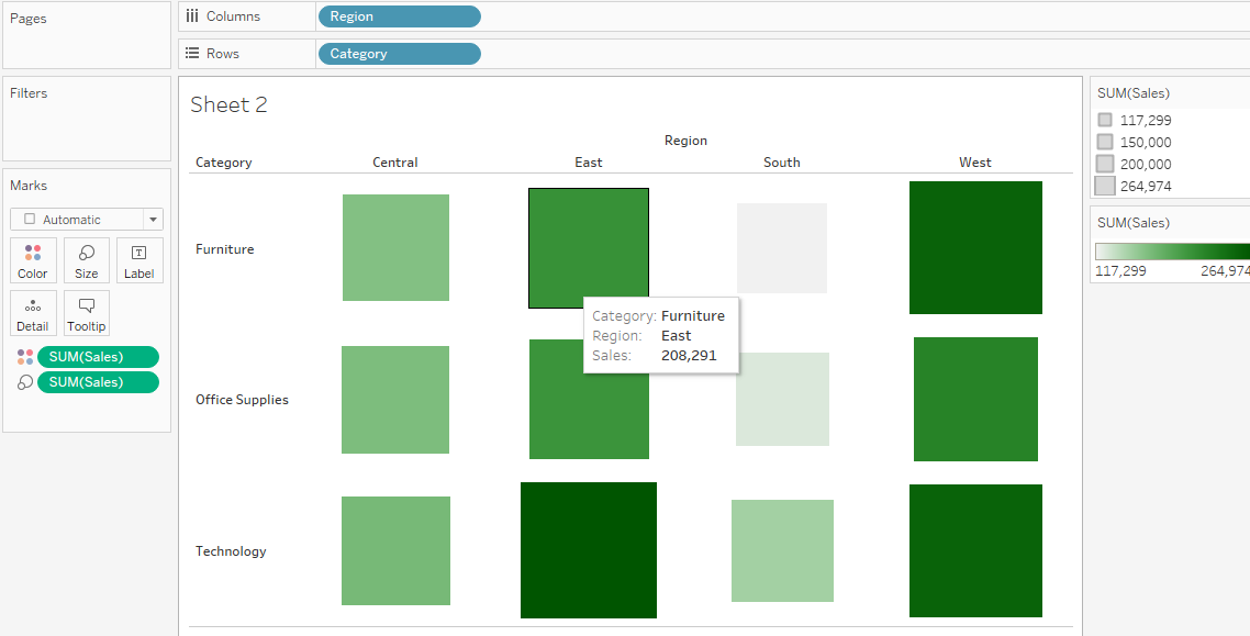
Tableau Heatmap Example
Let's consider an example using the Sample Superstore dataset. Suppose we want to analyze the sales performance across different product categories and regions. We can create a heatmap to visualize this data, where the rows represent product categories, the columns represent regions, and the color intensity represents sales.
How to Make a Heatmap in Tableau?
How to create a heatmap? Let’s walk through with an excellent example through a video representation below -
This video helps you understand the complete process of creating a Heatmap to visualize the relationship between age and college wins with hometown. Check out the steps below for better understanding -
Step 1 > Connect the "NFL Offensive Player stats, 1999-2013.xlsx" data set.
Step 2 > Drag the "Age" measure and drop it onto the column shelf.
Step 3 > Drag the "College wins" measure and drop it onto the row shelf.
Step 4 > Select the measured average of both features dragged in rows and columns.
Step 5 > Select the Density under the marks card drop-down menu.
Step 6 > Drop the "Hometown" dimension in the color field.
Step 7 > Edit color field and select Density - Multicolor palette.
Step 8 > Edit the size according to the requirement in the visualization using the Size field.
Our Heat Map is Ready!
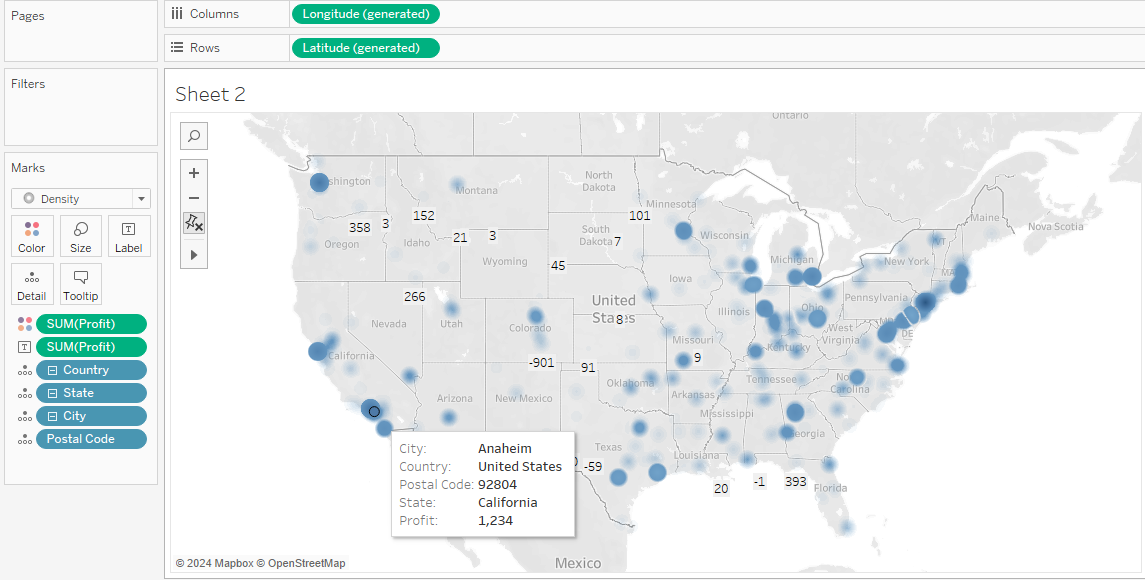
How to Create a Geographical Heat Map in Tableau?
In addition to traditional heatmaps, Tableau allows users to create geographical heat maps to visualize data spatially. Let's explore how to create a geographical heatmap with the help of an example -
Step 1: Connect your dataset to Tableau - Sample Superstore data set.
Step 2: Right-click on the geographic field (e.g., Country) in the Data pane, and select "Hierarchy" > "Create Hierarchy." Name the hierarchy (e.g., Mapping Items) and add fields in the order: Country > State > City > Postal Code.
Step 3: Double-click "Country" in the Data pane. Tableau automatically creates a map with one data point (e.g., United States). Click the "+" icon on the Marks card next to "Country" to add more levels of detail (e.g., State).
Step 4: On the Marks card, click the Mark Type drop-down and select "Filled Map."
Step 5: Drag a measure (e.g., Profit ) to "Color" on the Marks card to color states by the measure. Drag the same measure to "Label" on the Marks card to add labels.
Your geographical heat map is now ready -
[ Note - Refer to Tableau Guide for more detailed understanding and implementation. ]
You can customize your heat map by formatting labels, editing color schemes, and adjusting map styles to suit your visualization needs.
Heat Maps vs Treemap: Difference Between Heatmap and Treemap in Tableau
Heat maps use color intensity to represent data values across a geographic or grid-based layout, making it easy to identify patterns and trends. They're great for visualizing the density or concentration of data points, such as sales across different regions. On the other hand, tree maps display hierarchical data using nested rectangles, with each level representing a different category. This makes them ideal for illustrating the proportion of each category within a larger dataset, such as market share by product category. While heat maps excel in revealing spatial relationships and intensity variations, tree maps offer a clear hierarchical structure for exploring categorical data.
Master Creating Data Viz Charts in Tableau with ProjectPro!
Creating Treemaps in Tableau isn't just about understanding the software's technical aspects—it's about gaining practical experience through real-world projects. This hands-on approach strengthens your skills and prepares you for challenges in your career. ProjectPro offers over 250 solved projects in data science and big data, each accompanied by video explanations and downloadable source codes. This helps aspiring analysts and data scientists to dive into practical exercises that reflect industry demands. Working on diverse industry-grade projects can also help you improve your Tableau skills and deepen your grasp of data visualization concepts. So, take the initiative, engage in real-world projects, and let ProjectPro guide you toward mastering Tableau and advancing your career in data analytics and beyond.
Download Materials

What Users are saying..

Jingwei Li
ProjectPro is an awesome platform that helps me learn much hands-on industrial experience with a step-by-step walkthrough of projects. There are two primary paths to learn: Data Science and Big Data.... Read More