How to do PCA in R
In this recipe, we will learn what is PCA, what does it do and the steps to perform PCA in R in a simple and detailed manner.
How to do PCA in R
In this tutorial, you will learn –
• What is PCA?
• What does PCA do?
• How to perform PCA in R?
o How to use the prcomp() function to do PCA
o How to draw a PCA plot using base graphics and ggplot2
o How to determine how much variation each principal component accounts for
o How to examine the loading scores to determine what variables have the highest effect on the graph
Access Face Recognition Project Code using Facenet in Python
Table of Contents
What is PCA?
Principle Component Analysis is essentially a dimension reduction technique. It maximizes the variance while minimizing the columns. One of the popular statistical ways used in PCA is Eigendecomposition where we find eigenvalues and eigenvectors. It uses these eigenvalues and eigenvectors to convert a set of observations to a set of linearly uncorrelated variables, known as Principal Components. A more robust technique would be SVD or Singular-Value Decomposition which is used frequently for compressing, denoising, and data reduction. PCA finds the best components by fitting different “axis” when projecting values (scores) onto the system.
What does PCA do?
• Take a high dimensional dataset and shrink the dimensions i.e. the features
• Extract the important features of the data
• Find the fewest features that explain the maximum variance
How to perform PCA in R?
Let us first generate a fake dataset that we can use in the demonstration. We will make a matrix of data with 16 samples where we measured 150 genes in each sample
The first eight samples will be “wt” or “wild type” samples. “wt” samples are the normal, everyday samples. The last eight samples will be “ko” or knock-out samples. These are samples that are missing a gene.
Code:

#generating a psuedo dataset


#the data matrix will have 16 samples with 150 genes each

data <- matrix(nrow=150, ncol=16)


#naming the samples

colnames(data) <- c(

  paste("wt", 1:8, sep=""),#name for first 8 samples

  paste("ko", 1:8, sep=""))#name for next 8 samples


#naming gene1, gene2, ... , gene150

rownames(data) <- paste("gene", 1:150, sep="")


#adding psuedo read counts

for (i in 1:150) {

  wt.values <- rpois(8, lambda=sample(x=10:1000, size=1))

  ko.values <- rpois(8, lambda=sample(x=10:1000, size=1))


  data[i,] <- c(wt.values, ko.values)

}


#checking the dimensions of our data

print(dim(data))


#displaying first six rows of our data matrix

head(data)
Output:
[1] 150  16
      wt1 wt2 wt3 wt4 wt5 wt6 wt7 wt8 ko1 ko2 ko3 ko4 ko5 ko6 ko7 ko8
gene1 482 506 467 470 491 490 475 538 808 842 843 834 808 786 848 811
gene2 229 233 222 251 219 230 255 227  64  59  70  64  56  83  68  66
gene3 100  94  97  93  91  83 108 111 681 700 761 676 674 764 649 619
gene4 293 290 309 288 272 253 298 280 521 451 435 483 499 508 482 489
gene5  41  43  50  32  40  44  45  43 629 605 616 618 581 635 660 634
gene6  94  97  99  92 106 113  89  91 548 552 519 561 613 549 560 543
The samples are columns, and the genes are rows.
We next call prcomp() to do PCA on our data. By default, prcomp() expects the samples to be rows and the genes to be columns. Since the samples in our data matrix are columns, and the genes (variables) are rows we have to transpose the matrix using the t() function.
If we don’t transpose the matrix, we will ultimately get a graph that shows how the genes are related to each other. Our goal is to draw a graph that shows how the samples are related (or not related) to each other.
prcomp() returns three things:
1) x
2) sdev
3) rotation
Code:

#performing PCA on our data

pca <- prcomp(t(data), scale=TRUE)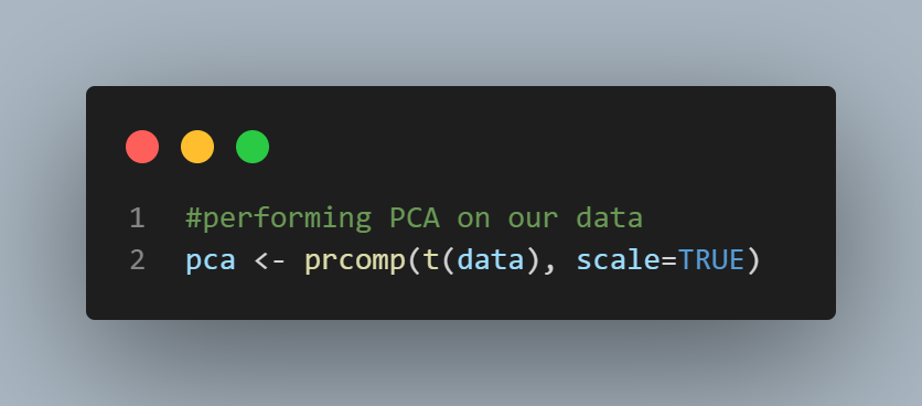
x contains the principal components (PCs) for drawing a graph. Here we are using the first two columns in x to draw a 2-D plot that uses the first two PCs.
The number of PCs is either number of variables or the number of samples, whichever is smaller. Since there are 16 samples in our data, there will be 16 PCs.
The first PC accounts for the most variation in the original data (the gene expression across all 16samples), the 2nd PC accounts for the second most variation, and so on. To plot a 2-D PCA graph, we usually use the first 2 PCs. However, sometimes we use PC2 and PC3.
Code:

#ploting PC1 and PC2

plot(pca$x[,1], pca$x[,2])
Output:

8 of the samples are on one side of the graph and the other 8 samples are on the other side of the graph. To get a sense of how meaningful these clusters are, let’s see how much variation in the original data PC1 accounts for.
To do this we use the square of sdev, which stands for “standard deviation”, to calculate how much variation in the original data each principal component accounts for.
Since the percentage of variation that each PC accounts for is way more interesting than the actual value, we calculate the percentages.
We then plot a Scree plot using the barplot() function. A Scree Plot is a graphical representation of percentages of variation for each PC account.
Code:

#making a scree plot

pca.var <- pca$sdev^2

pca.var.per <- round(pca.var/sum(pca.var)*100, 1)


#plotting the scree plot

barplot(pca.var.per, main="Scree Plot", xlab="Principal Component", ylab="Percent Variation")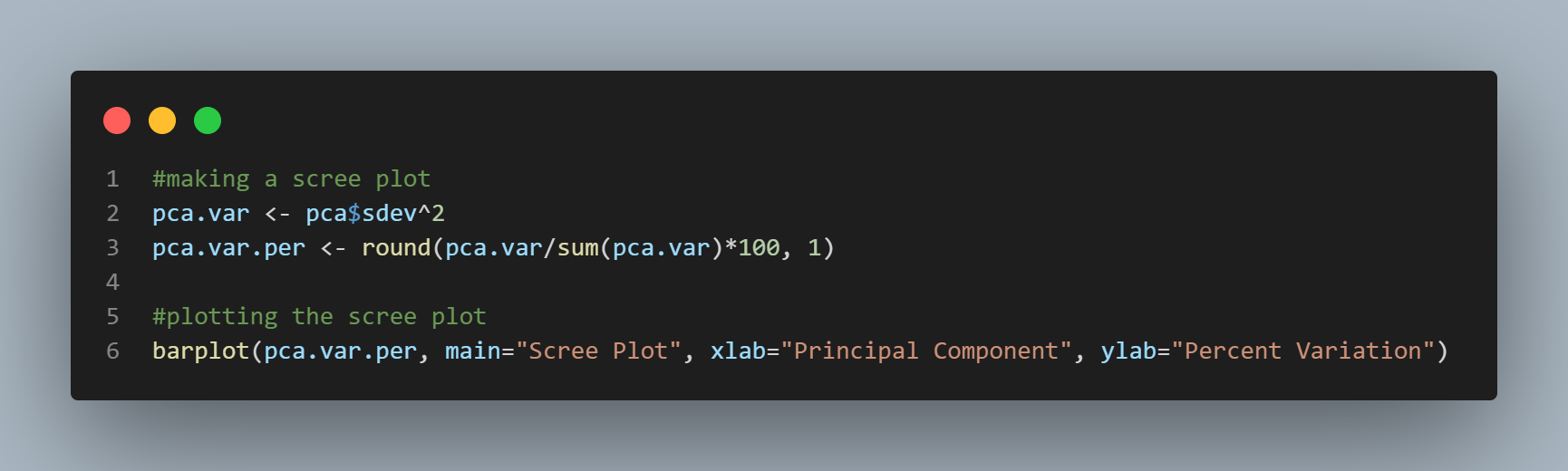
Output:

We can see that PC1 accounts for almost all of the variation in the data.
We can also use ggplot2 to make a fancy PCA plot that looks nice and also provides us with tons of information.
We will have to first format the data in the way ggplot2 accepts an input.
Code:

#making a fancy looking plot that shows the Principal Components and the variation


#loading ggplot2 library

library(ggplot2)


#formatting the data

pca_data <- data.frame(sample=rownames(pca$x),#1 column with sample ids

                       x=pca$x[,1],#2 columns for the X and Y

                       y=pca$x[,2])#coordinates for each sample


#displaying the data

pca_data
Here’s what the dataframe looks like. We have one row per sample. Each row has a sample ID and X/Y coordinates for that sample.
Output:
    sample         x           y
wt1    wt1 -11.23400  1.17331603
wt2    wt2 -11.53760  0.77640552
wt3    wt3 -10.76178  0.07678016
wt4    wt4 -11.07443 -3.89545911
wt5    wt5 -11.29756 -1.08112742
wt6    wt6 -11.18242 -0.36478413
wt7    wt7 -11.42466  0.79923698
wt8    wt8 -11.36885  2.35162562
ko1    ko1  10.96847  2.43797297
ko2    ko2  11.27375  0.77157119
ko3    ko3  11.27356 -0.92290039
ko4    ko4  11.10538 -0.72380971
ko5    ko5  11.63710 -1.42816083
ko6    ko6  11.13186  1.01207018
ko7    ko7  11.53505 -2.55330737
ko8    ko8  10.95612  1.57057030
Here’s the call to ggplot.
Code:

#plotting the data

ggplot(data=pca_data,aes(label=sample,x=x,y=y)) +

  ggtitle("PCA Plot") +

  geom_point() +

  xlab(paste("PC1: ",pca.var.per[1],"%",sep="")) +

  ylab(paste("PC2: ",pca.var.per[2],"%",sep=""))
• In the first part of our ggplot() call, we pass in the pca_data dataframe and tell ggplot which columns contain the X and Y coordinates and which column has the sample labels.
• Then we add a title to the graph using ggtitle().
• We then use geom_point() to tell ggplot to plot the data points.
• Lastly, we use xlab() and ylab() to add X and Y-axis labels. Here we are using the paste() function to combine the percentage of variation with some text to make the labels look nice.
Output:

The X-axis tells us what percentage of variation in the original data that PC1 accounts for. The Y-axis tells us what percentage of the variation in the original data PC2 accounts for.
You can also label the samples to know which ones are on the left and the right using geom_text() instead of geom_point().
Next, let us look at how to use loading scores to determine which genes have the largest effect on where samples are plotted in the PCA plot.
The prcomp() function calls the loading scores rotation. There are loading scores for each PC.
Here we are just going to look at the loading score of PC1 since it accounts for 88.7% of the variation in the data.
Genes that push samples to the left side of the graph will have large negative values and genes that push samples to the right will have large positive values.
Since we are interested in both sets of genes, we will use the abs() function to sort based on the number’s magnitude rather than from high to low.
We then get the names of the top 10 genes with the largest loading score magnitudes.
Lastly, we see which of these genes have positive loading scores and which ones have negative loading scores.
Code:

#getting the name of the top 5 genes that contribute the most to PC1


#getting the loading scores

loadingScores <- pca$rotation[,1]


#getting the magnitudes of loading scores

geneScores <- abs(loadingScores)


#sorting the magnitudes of the loading scores, from high to low

geneScoreRanked <- sort(geneScores, decreasing=TRUE)


#getting the names of the top 5 genes

top5genes <- names(geneScoreRanked[1:5])


#displaying the names of the top 5 genes

top5genes


#checking which of these genes have positive or negative loading scores

pca$rotation[top5genes,1]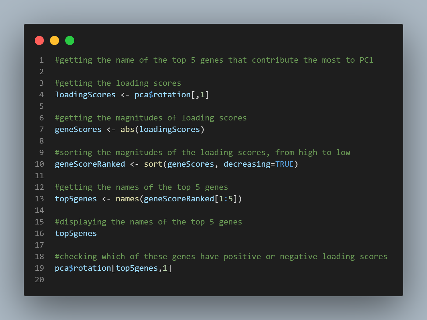
Output:

[1] "gene54"  "gene28"  "gene105" "gene146" "gene85"

     gene54      gene28     gene105     gene146      gene85
 0.08661512 -0.08661182  0.08660586 -0.08660324  0.08658913
Genes having positive loading scores push the “ko” samples to the right side of the graph and the genes having negative loading scores push the “wt” samples to the left side of the graph.
Hope you liked the tutorial! To learn how to perform PCA in python, you can refer to the following recipes –
https://www.projectpro.io/recipes/reduce-dimentionality-using-pca-in-python
https://www.projectpro.io/recipes/extract-features-using-pca-in-python

What Users are saying..

Anand Kumpatla
ProjectPro is a unique platform and helps many people in the industry to solve real-life problems with a step-by-step walkthrough of projects. A platform with some fantastic resources to gain... Read More