How to Create a Histogram in Tableau?
This tutorial is your go-to resource to learn how to make a histogram in Tableau. Dive into the methods to create and customize the bin sizes.
The Histogram chart displays a distribution shape with frequencies of variable values divided into ranges. It appears similar to a Bar chart, but it groups values into a range of continuous values. The histogram is created in Tableau with a continuous measure in the row shelf and a continuous or discrete measure that is bin into the column shelf. This tutorial will help you understand the complete process of creating a histogram in Tableau. So, let’s get started!
Table of Contents
What is Histogram in Tableau?
A histogram is a visual representation of the distribution of data points in a given dataset. It displays the frequency of data points falling within specified ranges, also known as bins. Histograms are particularly useful for analyzing the distribution of continuous data and identifying patterns or outliers within the data.
How to Create a Histogram in Tableau?
You can easily create a Histogram in Tableau by following a few steps -
-
Ensure your dataset is loaded into Tableau and the fields you want to analyze are appropriately formatted.
-
Start by opening Tableau and connecting to your dataset. Then, drag the desired measure (the numerical data you want to analyze) onto the Columns shelf.
-
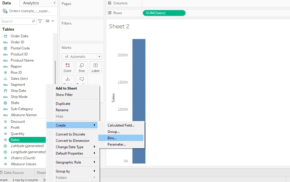
To create bins, right-click on the measure on the Columns shelf, select 'Create,' and then choose 'Bins.' This will prompt you to specify the size of the bins or let Tableau automatically determine them based on the data distribution.
-
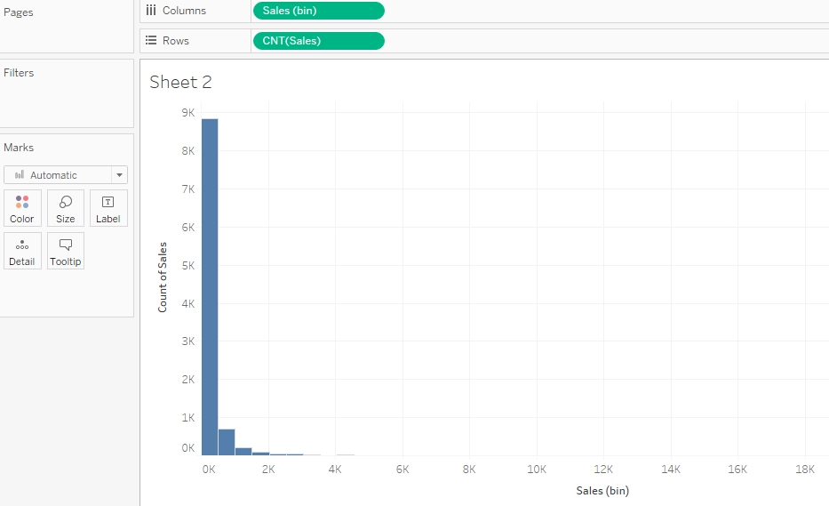
After creating bins, Tableau will automatically generate a histogram on the view. You can customize the appearance by adjusting the colors, axes, and labels according to your preferences.
Now that you're familiar with the steps in creating a histogram in Tableau let's put theory into practice. Below, we'll demonstrate how to plot a histogram using Tableau:
Watch the video below as we demonstrate the step-by-step process of plotting college wins (binned into ranges) against the count of college wins. This will help you understand how to visualize the distribution of college wins using Tableau.
How to Create Histograms with Ranges in Tableau?
Creating histograms with ranges involves defining bins or intervals for your data. Drag the measure you want to visualize (such as Sales) to the Columns shelf to do this. Then, right-click on the measure and select 'Create' > 'Bins'. Tableau will automatically create bins based on the data distribution. Once your bins are defined, simply drag the bin field to the Rows shelf to create the histogram. You can refine the visualization by adjusting the axis, formatting, and adding additional layers or filters.
Let's consider an example from the Sample Superstore dataset - Suppose we want to create a histogram to visualize sales distribution across different ranges. We start by dragging the 'Sales' measure to the Columns shelf and then right-clicking on it to create bins. We can choose a bin size that suits our analysis.

After defining the bins, we drag the bin field to the Rows shelf to create the histogram. This visualization will display the frequency or count of sales falling within each bin range.

How to Change Bin Size of Histograms in Tableau?
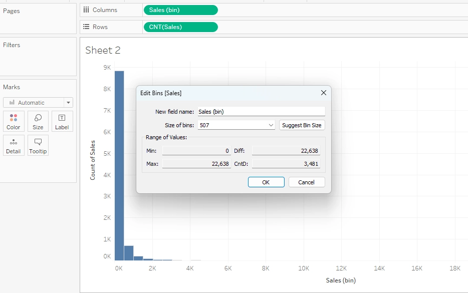
Sometimes, you should change the bin size of your Histogram. To do this, you can right-click on the bin field on the Columns shelf and select 'Edit' > 'Bins' to manually adjust the bin size. Alternatively, you can adjust the bin size directly on the axis by clicking on the drop-down menu next to the bin field and selecting 'Edit.' This lets you change the bin size dynamically by dragging a slider or entering a specific value.

How to Turn Multiple Columns into One and Create a Histogram in Tableau?
Sometimes, you may need to combine data from multiple columns into a single field before creating a histogram in Tableau. Here's how you can do it:
-
Data Blending: If your data is stored in multiple tables or sheets, you can blend the data in Tableau by defining relationships between the relevant fields.
-
Data Reshaping: Use Tableau's data reshaping features, such as pivot or join, to merge data from different columns into a single field.
-
Calculated Fields: Alternatively, you can create calculated fields in Tableau to combine data from multiple columns into a single field that can be used to create a histogram.
Master Data Visualization Skills with ProjectPro!
This tutorial has provided a clear roadmap for creating a histogram in Tableau. Yet, knowledge alone isn't always enough; practical experience is vital. Real-world projects are crucial for applying theoretical knowledge and developing practical skills essential for success in data analytics. ProjectPro offers a valuable platform for this purpose that helps individuals bridge the gap between theory and practice—practicing with 250+ solved industry-grade projects provided by ProjectPro helps aspiring data analysts enhance their skills, confidence, and employability. So, refine your data analytics skills through practical experience with ProjectPro and unlock your full potential in the field.
Download Materials

